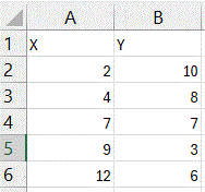
 Enter your scatterplot data into two columns.
I recommend labeling your columns (meaningful labels will be better, but “X” and “Y” will work fine for this example).
This example has five data points:
(2, 10), (4, 8), (7, 7), (9, 3), (12, 6)- Generate a scatterplot of the data.
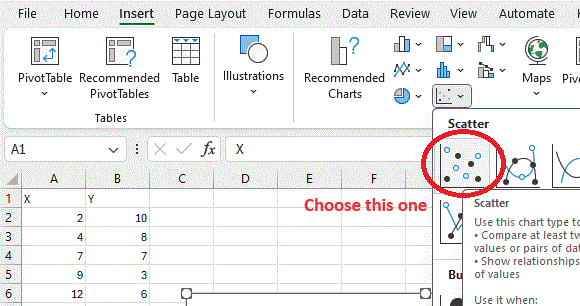
Select the data (including the headers), which can be done by either clicking on cell A1 and while holding the mouse button down, dragging to cell B6; or by clicking on cell A1 without holding the mouse button down, and then shift-clicking on cell B6.
Then, from the Insert menu, choose the chart with only dots, picking the first one (upper left) from the scatterplots in the submenu. (See picture below)
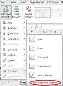
- Add the trendline to the graph.
After clicking anywhere on the scatterplot just created, go to the Chart Design menu, and select from the Add Chart Element option, which will be the option to the far left of the Chart Design menu. From this list select Trendline and then More Trendline Options...
A Format Trendline box should appear, and most likely the Linear option will already be selected. At the very bottom of this box (you may have to scroll down to see it), you can check the box for Display Equation on chart or Display R-squared value on chart (or both), depending on what information about the trendline you would like displayed.
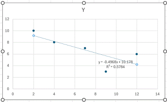
In this particular example, the picture of the trendline shows that the slope of the trendline is negative. The equation displayed gives the value of the slope (–0.4968) and y-intercept (10.178). The square of the Pearson Correlation Coefficient (R²) is 0.5784, and to get the value of the coefficient itself, you can use Excel (or any calculator) to take the square root. Since the trendline has a negative slope, choose the negative square root, in this case –0.7605.
Neil Simonetti