 Enter your scatterplot data into two columns.
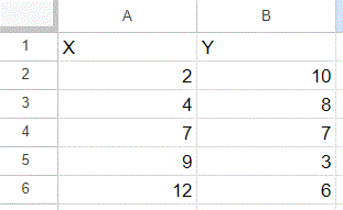
I recommend labeling your columns (meaningful labels will be better, but “X” and “Y” will work fine for this example).
This example has five data points:
(2, 10), (4, 8), (7, 7), (9, 3), (12, 6)-
Generate a scatterplot of the data.
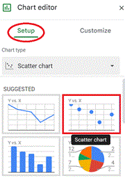
Select the data (including the headers), which can be done by either clicking on cell A1 and while holding the mouse button down, dragging to cell B6; or by clicking on cell A1 without holding the mouse button down, and then shift-clicking on cell B6.
Then, from the Insert menu, choose the Chart. The Chart editor should appear to the right of screen, with Setup selected. From the first option, Chart type, choose the Scatter chart, which should be one of the SUGGESTED types (if not, scroll down to find it).
If the Chart editor is closed, you can open it by clicking on the chart, then clicking on the three vertical dots in the upper right corner of the chart, and then selecting Edit chart.
- Add the trendline to the graph.
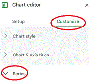
Now, from the Chart editor, select Customize and then Series. Scroll down until you can check the Trendline box (see below). If you want to see the trendline equation, change the Label to “Use Equation”. If you want to see the value of R², check the box for “Show R²”.
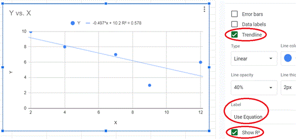
In this particular example, the picture of the trendline shows that the slope of the trendline is negative. The equation displayed gives the value of the slope (–0.497) and y-intercept (10.2). The square of the Pearson Correlation Coefficient (R²) is 0.578, and to get the value of the coefficient itself, you can use Sheets (or any calculator) to take the square root. Since the trendline has a negative slope, choose the negative square root, in this case –0.760.
Neil Simonetti